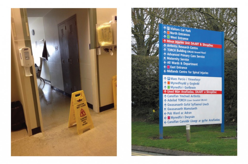
It’s about time we got another installment of Healthcare Graphics Need Help out, so let’s jump right into things. Above are two photos of typical hospital signage. What about them?
First, the one on the left. What if we told you that this is a real hospital room that we saw visiting a hospitalized family member, and that one of the patients in that room was under isolation for having a potentially contagious disease? There’s nothing warning anyone of this fact outside of a small, laminated, almost hidden notice pinned to a curtain inside the room. The floor sign, however, clearly lets us know that the floor is wet. Wonderful demonstration of priorities!
The biggest problem with this setup isn’t visitors, who don’t know to wash their hands when touching their loved one. Nor is it the physicians and nurses who do and who have access to charts and such. It’s the other staff in the hospital. The guy from food services. The cleaner from environmental services. The porters who move patients from place to place. These people are being put at risk every time they come into work and there’s no warning to them whatsoever – they had to be told that the curtain notice was there by another visitor and were very thankful for the warning!
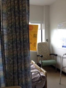
Secondly, the one on the right. The greatest amount of signage in any hospital is devoted to what we in the industry call “wayfinding,” directing people from one place to another both indoors and outside. They have become routine, bordering on boilerplate. The same modular construction, the same few font families, the same text-on-solid-colour-with-arrow design. It’s safe, non-offensive and easy to update.
What’s wrong is that hospital administrations seem content to spend money on their wayfinding signage to the expense of others. They understand and recognize that this signage speaks to people of their precious hospital brand – like being seen in a clean, shiny car. What they often lack is the follow-through – they go all-out, spending on a clean, flashy wayfinding system and then when it comes time to look at signage for controlling infection we hear that they “don’t have the money” and find that they’re using unprofessional, ad-hoc or handmade signs, if even that. That’s a problem – their shiny car is parked in a filthy vacant lot.
So, while it’s a bit tacky to end this with a sales pitch, our Patient Guard inserts are $0.75 a pop and use a Human Factors approach to get around the issues associated with clearly labeling a room containing a patient under isolation. This effectively reduces risk to everyone wishing to enter a now well-signed isolation room. Visitors, porters, nurses, everyone.
“Don’t have the money” is no excuse given how much healthcare associated infections, workplace-acquired infections and full-blown pandemics cost to handle.
And trust us – we’ve been doing signs for over 25 years and Infection Control ones for 10 – clean, symbolic, readable infection control signage like ours is a much, much better representation of a hospital brand than the ad-hoc or absent signs currently in use. And that’s just the beginning of a complete graphical infection control communication system, read more here.
Sorry if all that was a bit harsh, but it needed to be said.


For the record it’s my mother who is in hospital and this story is unfortunately very real. If it’s happening under my watch, it’s happening everywhere and that’s just a crying shame.
She’s recovering from a fall and due to her ripe age of 87, they will not operate because she’s high risk. However, last week the hospital made a decision to place an isolated patient in the bed beside her. Has her “risk level” changed? I think not.
It was I who notified the house keeping staff, the porter, food services and other visitors that the patient in the other bed was under contact isolation. They were all scared and wondered where the signs were. Food services was trying to get me to delivery the food tray for them!
I’m the 12th of 13 children so, I get the many updates from my family – they know I’ve spent the past 10 years bringing my 25+ years sign trade expertise to infection control communication. Plus they know that I’m a caring individual who gets things done. Just yesterday, my brother and sister-in-law (recently retired principal) was told to dawn PPE while visiting mom – this was a first! They did as they were told, but then my sister-in-law, in her PPE left the room to ask a question…she was told she’s not to leave the room with her PPE on! There were no signs in the room to tell her what to do, she was left with no instruction by the nurse.
Last night after my shift with mom, more family arrived and I had to tell them about the isolated patient once again. They too asked where’s the signs! It was taped to the open door which of course made it hard to see. This is why I invented the Patient Guard because often doors are left ajar for many reasons. This was not a money grab, if there had been either a suitable product already in use or effective procedures in place, I would not have had to invent it in the first place.
With the way things are right now, we’re not ready to handle even a simple case of MRSA with any reliability, never mind whatever else might be out there.