In our last column, we took a look at a variety of Hand Hygiene posters used by large health organizations, and what they could do to better communicate. To summarize, the lesson we learned is that simply writing “hand hygiene” somewhere on them is not the same thing as them saying “hand hygiene,” and one tool that can fix that fairly quickly is to show action in the graphics – hands that are clearly shown in the action of cleaning themselves.
Then we posted this example:
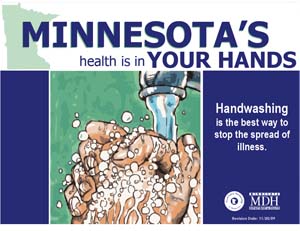
Apologies to Minnesota’s Department of Health if it seems that we’re picking on you. This poster does get the action across well – this is clearly an illustration of a pair of soapy hands, showing the action of washing. A running tap is even visible!
Step back, however. What do you read? We read “MINNESOTA’S YOUR HANDS”, which seems incoherent. Let’s look at a couple more posters to see if we can figure out a trend.
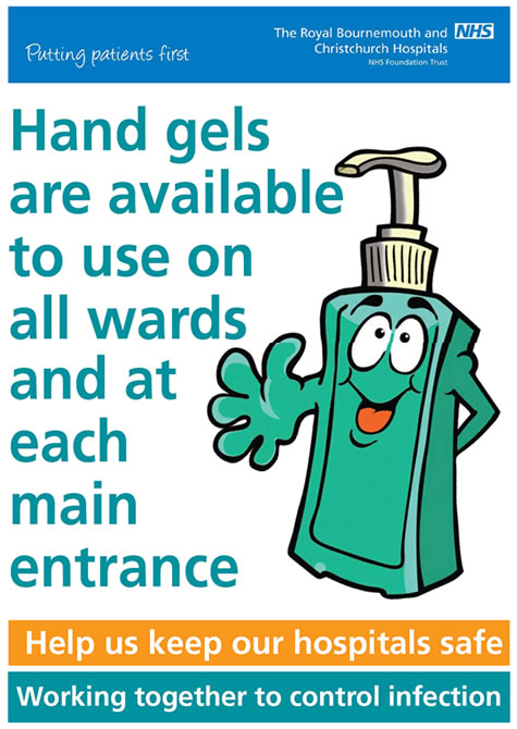
This one has an interesting problem. The designer saw fit to make the biggest bit of text that you see the wordy sentence “Hand gels are available to use on all wards and at each main entrance”, which means that they considered it the most important. Did the NHS run that past a copywriter first? Why the wishy-washy “are available to use” and not the stronger “must be used?”
And we won’t comment on the hand gel dispenser mascot. For now, at least.
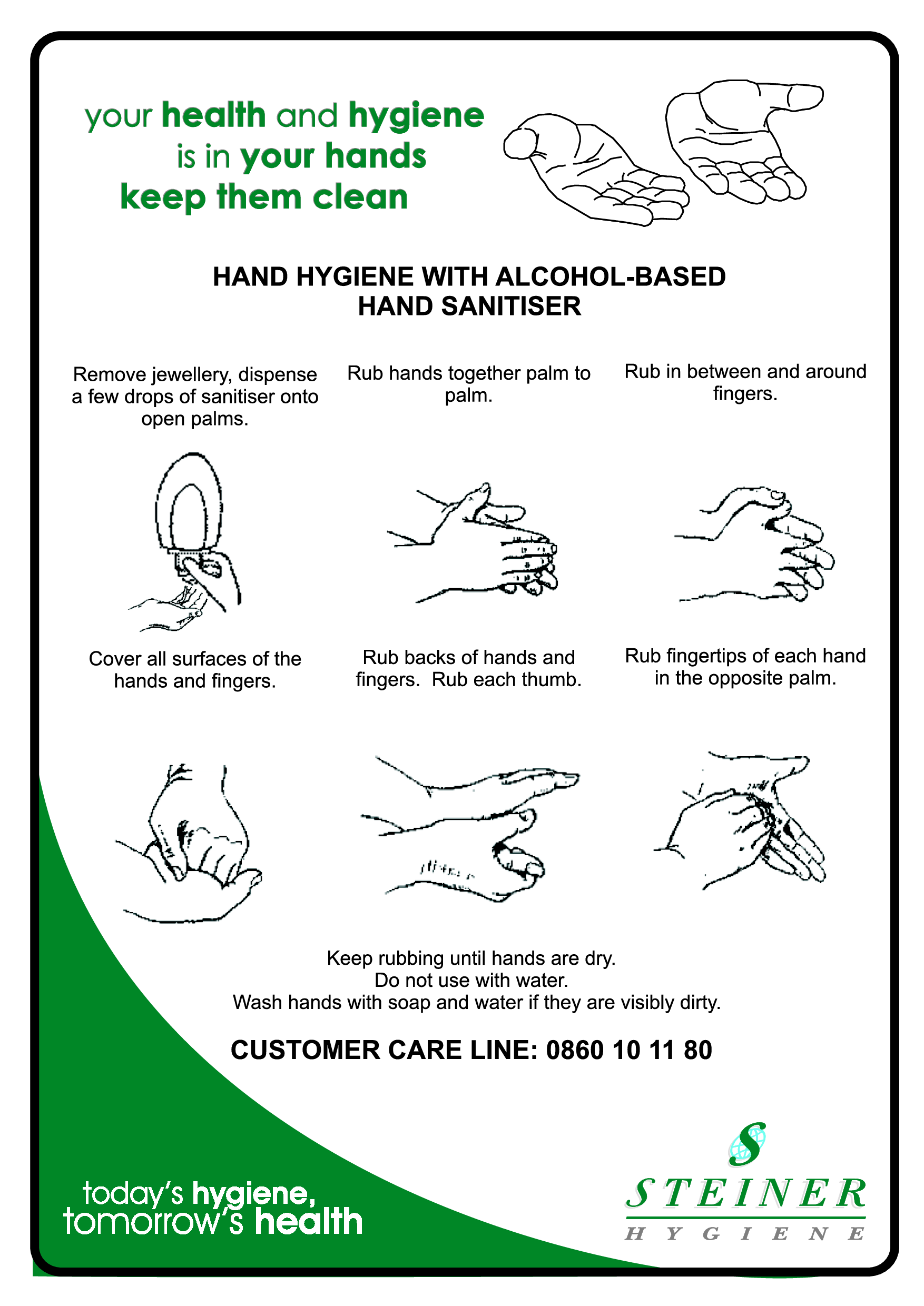
This one isn’t too bad, except for the part where none of the type stands out from the rest at all. The text in the swoosh in the lower-left is the same visual priority as the stuff in the upper-left, the centred black text, and the logo. We don’t know where to start reading, or even if the poster is relevant to us without having to squint at it.
Why is this important? Designers have a little tool that we can use to control people’s minds. At least, we can control what they read in a design and in what order, through exercising what we call “type heirarchy.”
There are many ways to accomplish this. We can control the size of the text element, it’s colour, thickness (weight), font, and style relative to others in the design. We can control its position relative to others – we read left-to-right, top-to-bottom. The goal is to ensure that people read in the intended order.
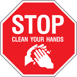
Here is a good example:
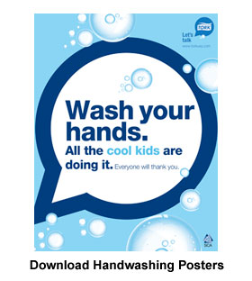
This designer was paying attention to heirarchy. The first thing you read is “Wash your hands” followed by “all the cool kids are doing it” with the bonus “cool kids” popping out in a lighter blue. “Everyone will thank you” is a nice third line to reward anyone who reads that far, but isn’t strictly needed. That’s why it’s small!
That’s what you want! If someone doesn’t read the whole poster, they at least will walk away with your message in their heads.
In the first example at the top, people walk away possibly thinking that the poster is about Minnesota, which isn’t supposed to be the main point of the poster. The second example might be successful in informing folks that hand gel is available, assuming they read the whole headline but would be more successfully served by a shorter, more direct headline. The third one may as well be blueprints or technical drawings – though official-looking, it doesn’t do the job of passing on its main message.
So, our advice is that if you have a message to get out through a poster or other graphic, make sure that type heirarchy favours that message before anything else. Otherwise, people may just walk away thinking your hand hygiene poster is actually about Minnesota.
Leave a Reply